There are several kinds of charts offered by Tableau. Charts are used to convey more message in a simple way in less time.
Text_Table:
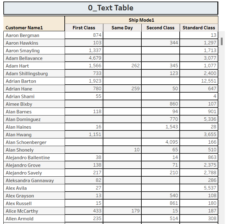
These kinds of charts are being used for the data like a table, it includes Zero or more Dimensions & Zero or more Measures.
Steps:
1) Drag Column [Ship Mode] onto the Column shelf.
2) Drag Column [Customer Name] onto the Row shelf.
3) Drag Column [Sales] onto the Text shelf.
4) Select Text Table, from Show Me canvas.
—-------------- —---------------- —------------------ —--------------------
Highlight_Table:
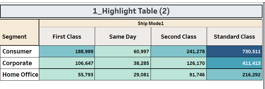
1) These kinds of charts are being used to show the data like a table, it includes Dimensions & Measures. We can highlight the data based on colors.
2) In a glance we can identify which are having more weightage and which are having less weightage in terms of specified measure.
3) It is an Advanced CrossTab view, it has color legend & Size Legend.
4) We can place one or more dimensions and only one measure
Steps:
1) Drag Column [Ship Mode] onto the Column shelf.
2) Drag Column [Segment] onto the Row shelf.
3) Drag Column [Sales] onto the Text shelf.
4) Select Highlight Table, from Show Me canvas.
—-------------- —---------------- —------------------ —--------------------
Heat Maps:
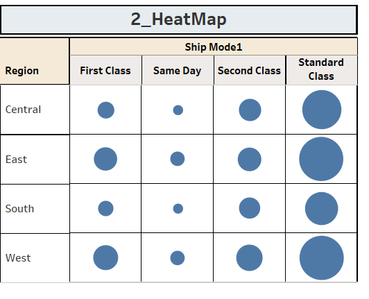
These kinds of charts are being used to show the data like a table and compare different values of the dimension, it includes Dimensions & Measures. We can highlight the data based on colors.
The main difference between Heat Map & Highlight tables is that Heat map has one option that Cell size is controlled by measure value. We can use different measures to represent color and size.
Steps:
1) Drag Column [Ship Mode] onto the Column shelf.
2) Drag Column [Region] onto the Row shelf.
3) Drag Column [Sales] onto the Text shelf.
4) Select Heat Map, from Show Me canvas.
—-------------- —---------------- —------------------ —--------------------
Line Charts
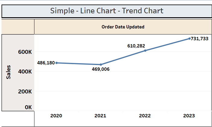
Line charts are used to show the trends over a period of time. Here we are using the Time Dimension as 'Discrete'.
Steps:
1) Select [Order Date Updated] &[Sales] using the control button and select Line Chart from Show Me canvas.
2) Right click on [Order Date Updated] on the columns shelf, then select 'Discrete'.
Line charts are used to show the trends over a period of time. Here we use the Date field as 'Continuous'.
Steps:
1) Select [Order Date Updated] &[Sales] using the control button and select Line Chart from Show Me canvas.
2) Right click on [Order Date Updated] on the columns shelf, then select 'Continuous'.
3) Drag [Segment] onto the Detail shelf, now the View shows Year wise Sales further breakdown by Segments.

—-------------- —---------------- —------------------ —--------------------
Area Charts:
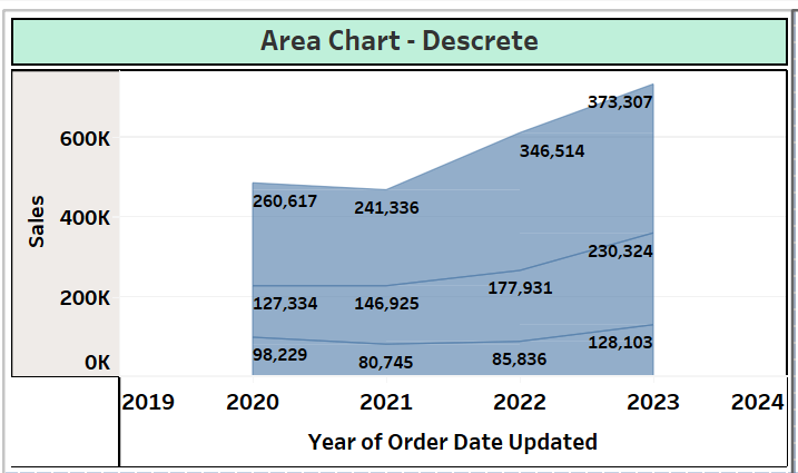
Area charts are similar to Line charts, we use them to show the trends over a period of time. Here it occupies the space by color. Here we use the Date field as 'Discrete'.
Steps:
1) Select [Order Date Updated] &[Sales] using the control button and select Area Chart from Show Me canvas.
2) Right click on [Order Date Updated] on the columns shelf, then select 'Discrete'.
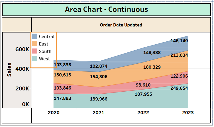
Area charts are similar to Line charts, we use them to show the trends over a period of time. Here it occupies the space by color. Here we use the Date field as 'Continuous'.
Steps:
1) Select [Order Date Updated] &[Sales] using the control button and select Area Chart from Show Me canvas.
2) Right click on [Order Date Updated] on the columns shelf, then select 'Continuous'.
3) Drag [Region] onto the Color shelf, now the View shows Year wise Sales further breakdown by Regions.
—-------------- —---------------- —------------------ —--------------------
Circle Views:
Circle Views are one kind of chart, we use One More Dimensions and One More measures.
Steps:
1) Select [Category] &[Sales] using the control button and select Circle View from Show Me canvas.
2) Drag [Region] onto the Colors shelf.

-------------- —---------------- —------------------ —--------------------
Side by Side Circle View
Circle Views are one kind of chart, we use One More Dimensions and One More measures.
Steps:
1) Select [Region] &[Sales] using the control button and select Circle View from Show Me canvas.
2) Drag [Category],[Order Date Updated] onto the Column shelf.
3) Now this view Shows the sales of Category and further divide into Year wise.
4) Easy to compare the Each Category Sales YoY.

—-------------- —---------------- —------------------ —--------------------
Tree Maps
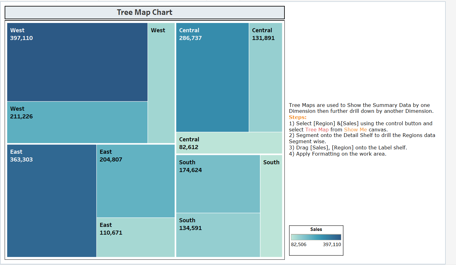
Tree Maps are used to Show the Summary Data by one Dimension then further drill down by another Dimension. It used to show hierarchical relationship related data on the views.
Steps:
1) Select [Region] &[Sales] using the control button and select Tree Map from Show Me canvas.
2) Segment onto the Detail Shelf to drill the Regions data Segment wise.
3) Drag [Sales], [Region] onto the Label shelf.
4) Apply Formatting on the work area.
—-------------- —---------------- —------------------ —--------------------
Bar graphs
We use Bar graphs to compare a measure among the members of a dimension.
In this example, We are comparing each Region's Sales over several years.
Bars are visualized in a horizontal way.
Steps:
1) Drag Columns [Region], [Order Data Updated] onto the Rows shelf, [Sales] onto the Column shelf.
2) Select Horizontal Bar chart from Show Me canvas.
3) Drag Column [Region] onto the Colors Shelf.
4) Apply Formatting on the work area.

—-
We use Bar graphs to compare a measure among the members of a dimension.
In this example, We are splitting each Region by years.
Steps:
1) Drag Columns [Region] ,[Order Date Updated] on to Column shelf, [Sales] on to Rows shelf.
2) Select Stacked Bar chart from Show Me canvas.
3) Drag Column [Order Date Updated] onto the Colors Shelf.
4) Apply Formatting on the work area.

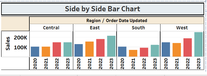
We use Bar graphs to compare a measure among the members of a dimension.
In this example, We are comparing each Region's Sales over several years.
Bars are visualized in a vertical way.
Steps:
1) Drag Columns [Region] ,[Order Date Updated] on to Column shelf, [Sales] on to Rows shelf.
2) Select Bar chart from Show Me canvas.
3) Drag Column [Order Date Updated] onto the Colors Shelf.
4) Apply Formatting on the work area.
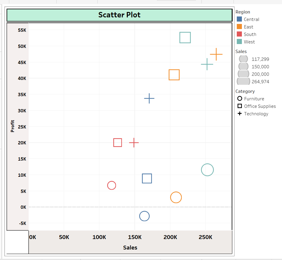
Scatter Plots:
Scatter Plots are used to show the co-relationship between two measure values.
Further we can drill down by using dimensions.
Steps:
1) Select [Profit] &[Sales] using the control button and select Scatter Plot from Show Me canvas.
2) Drag [Region] onto the Color shelf, now the View shows Year wise Sales & Profit.
3) It shows co-relationship between [Profit] &[Sales] further broken down by [Region] wise.
Bubble Charts:
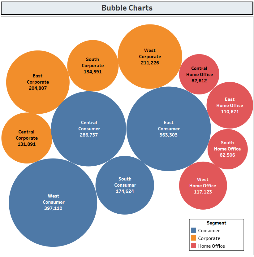
We can measure for bubble size, we can use a dimension to apply different colors on different dimension members. It is one of the good looking visualizations. We use it in text mining as well.
Steps:
1) Select [Profit] &[Sales] using the control button and select Scatter Plot from Show Me canvas.
2) Drag [Region] onto the Color shelf, now the View shows Year wise Sales & Profit.
Pie charts:
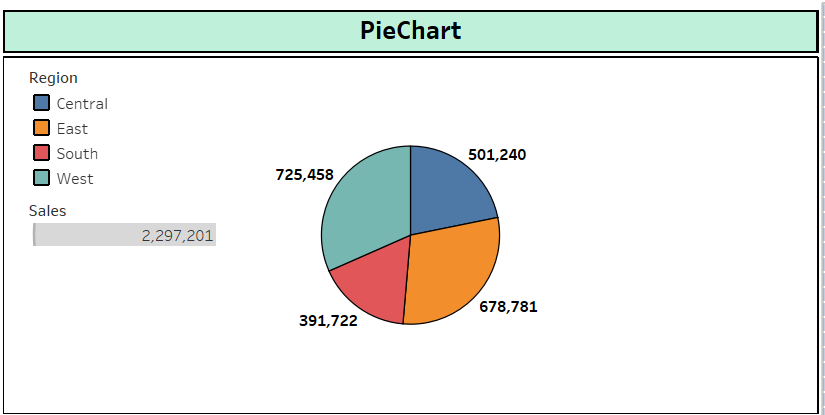
We use Pie charts to show the contribution of each member of a specific dimension in specific measure.
In this example, We are getting each region's contribution or proportion in the Sales measure.
Steps:
1) Select [Region] &[Sales] using the control button and select Pie Plot from Show Me canvas.
2) Drag [Region] onto the Label shelf, now the View shows Region wise Sales.
—--------------------
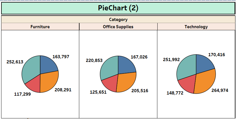
Steps:
1) Select [Region] &[Sales] using the control button and select Pie Plot from Show Me canvas.
2) Drag [Region] onto the Label shelf, now the View shows Region wise Sales.
3) Drag [Category] onto the Column shelf, now the View shows Category wise Sales, Each category is further divided into different regions.
—--------- —-------------- —------------------------
Maps:
These kinds of maps are used to show the Geographical data on the global maps with symbols, color depends on the dimension we placed in the colors shelf.
Steps:
1) Open Tableau Software, connect to the Sample Database.
2) By using mouse hold fields [State], [Sales] then select Symbol Maps from Show Me canvas. We can change symbols from Mark cards.
3) Apply formatting to the maps.
4) Drag [State], [Sales] onto the Labels shelf, [Region] onto Colors shelf.

These kinds of maps are used to show the Geographical data on the global maps with filled color, color thickness depends on measure value.
Steps:
1) Open Tableau Software, connect to the Sample Database.
2) By using mouse hold fields [State], [Sales] then select Filled Maps from Show Me canvas.
3) Apply formatting to the maps.
4) Drag [State] , [Sales] onto the Labels shelf.

—---------------------
Example of advanced maps.
Steps:
1) Open Tableau Software, connect to the Sample Database.
2) By using mouse hold fields [State], [Sales] then select Symbol Maps from Show Me canvas. We can change symbols from Mark cards, here selecting PIE charts
3) Apply formatting to the maps.
4) Drag [State], [Sales] onto the Labels shelf, [Region] onto Colors shelf.
5) We can show the [% of Sales] by [Category] within each [State] by using Table Calculations.

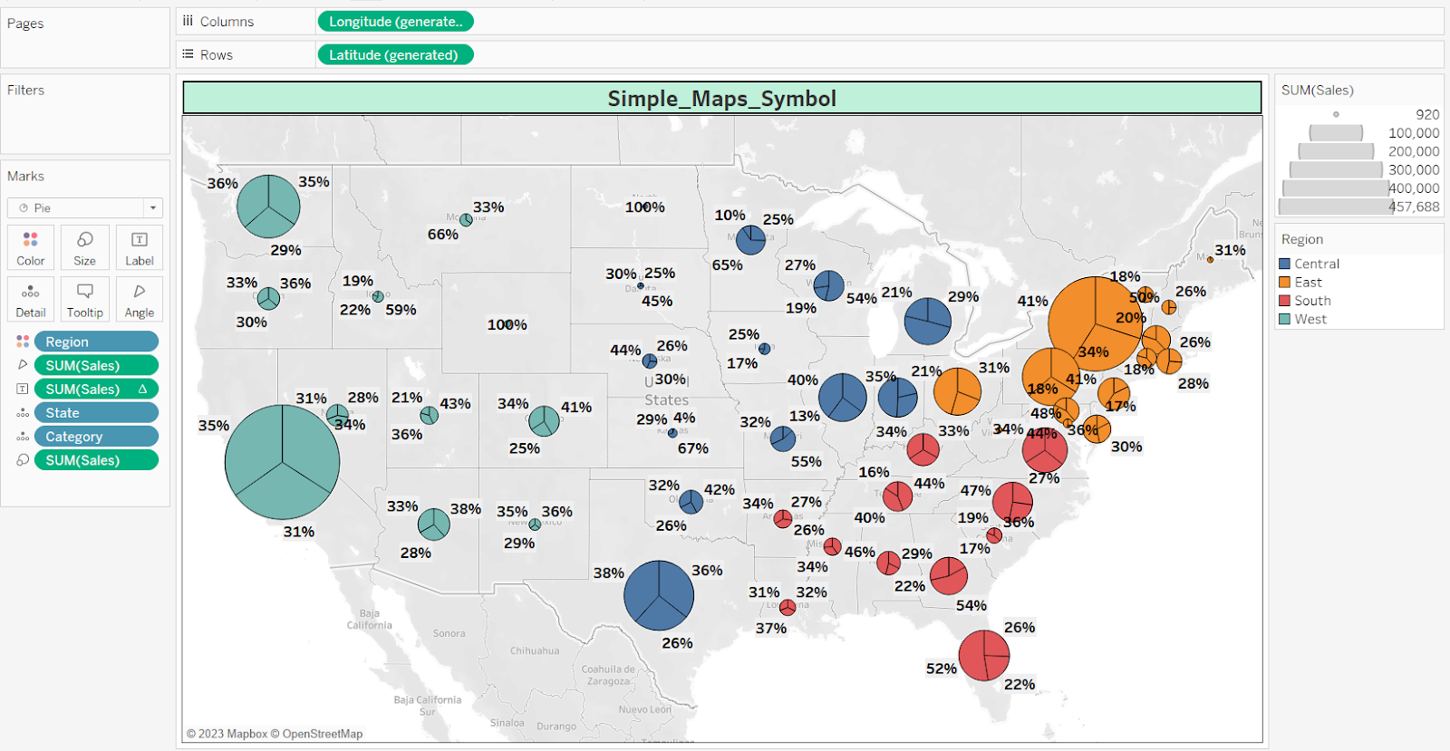
Now Category has been used to apply the color palette.

---------------
Dual Axis:
Showing 1 Measure values on top on another Measure Values, it means override the Measure Values.
Main Usage is comparing two KPI's for any Dimension.
EX: BUZ User Wants to see Sales, Profits of Regions in the Single Report.
1) Drag the Regions on to Rows shelf, Sales & Profit fields onto Columns Shelf.
2) To differentiate measures, apply different colors for both Measures.
3) Right click on Second measure in the work Area, then click on "Dual Axis".
4) Now Report will show two measure values in single pane.
Have to Keep 1st Max Value KPI then Less Value KPI.
Synchronize Axis:
To follow the Same Scale for both Measures.
ttps://public.tableau.com/app/profile/kumar.tableau/viz/CahrtTypes-BasicandAdvanced/Sheet39

